TOPIA - 2024
builder mode

01
overview
Context
Topia is an application that allows users to engage in real-time experiences through spatial communication within personalized virtual worlds. On the Topia platform, users can construct their worlds using "Assets" – PNG images that can be uploaded to the platform or acquired from the marketplace. Once users have their assets, they can create their world by placing these assets on a canvas. Users have various actions at their disposal to modify an asset, including moving, duplicating, flipping horizontally, and scaling.
Purpose of the redesign
1. Frequent User Feedback: Consistent feedback from users highlighted areas that needed improvement.
2. Identified User Difficulties: User feedback indicated specific difficulties and dissatisfaction with the current world building feature
3. Technological Advancements: Recent technological advancements to the renderer provided new opportunities to enhance the feature's functionality and performance..
Goal
Redesign the World Builder tool to address user concerns, enhance usability, and boost engagement by transforming world-building into an enjoyable and creative activity, ultimately increasing the number of cool worlds available to explore in Topia.
02
discovery
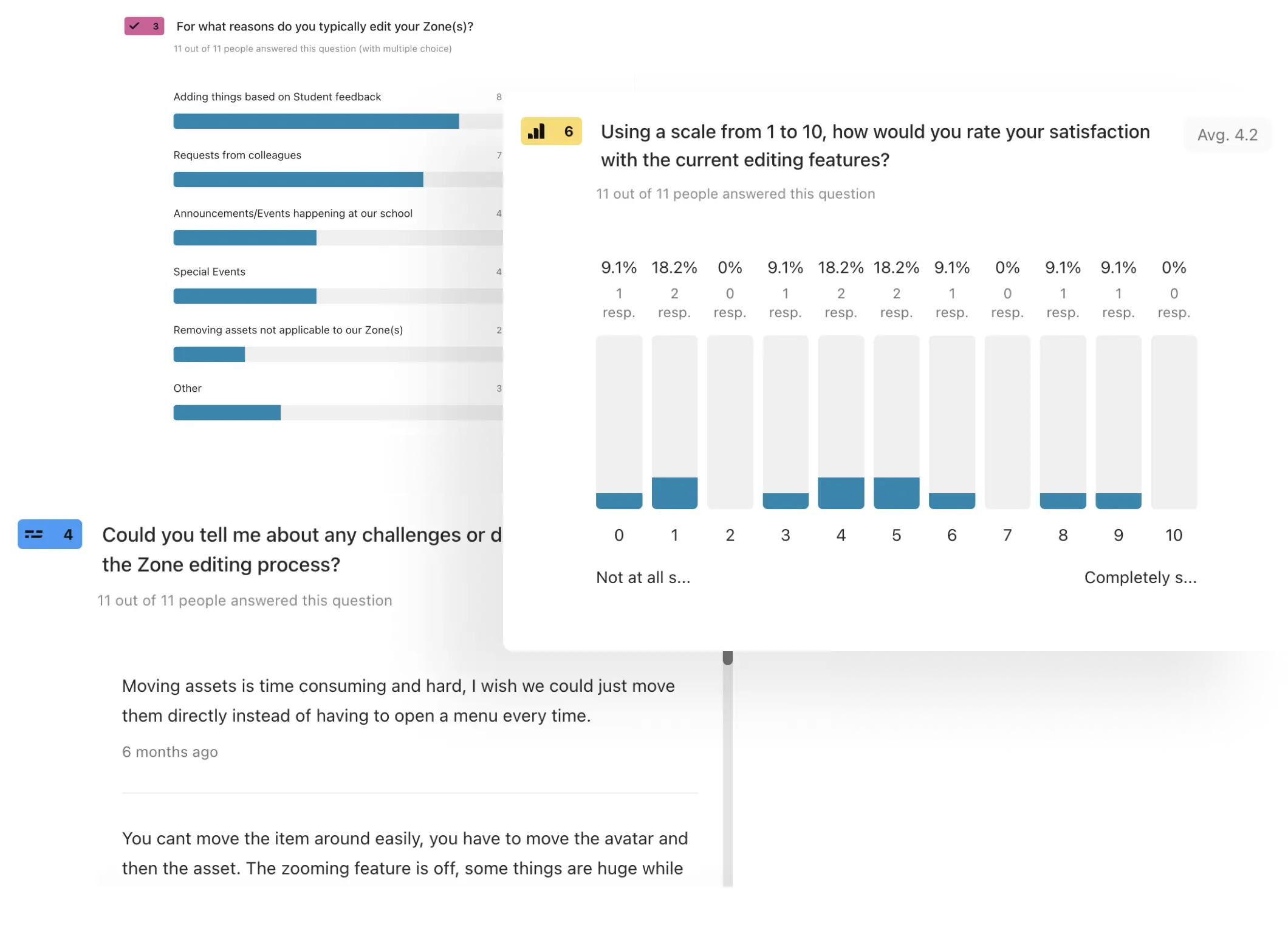
User survey
Scheduling interviews was challenging due to time constraints and admin issues. However, surveys allowed us to quickly reach a large audience and gather valuable feedback efficiently.
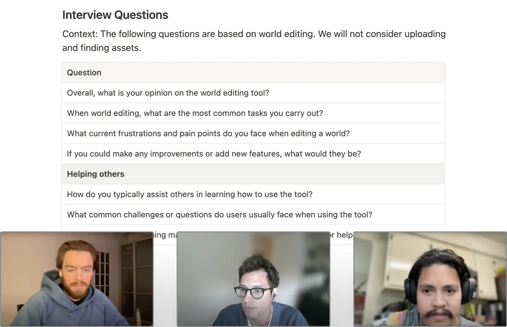
User interviews
Our team members, as power users, provided insights into pain points and unmet needs of the tool. Understanding their experiences helped identify key areas for improvement.
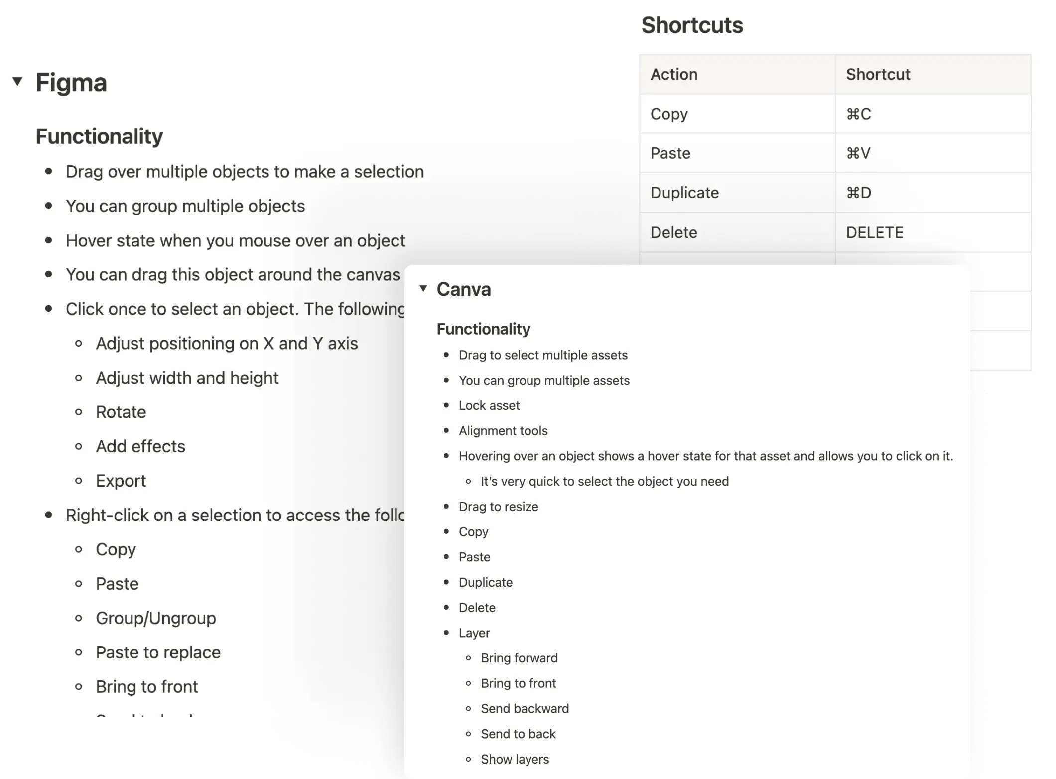
Industry research
Researching common actions in industry-standard design tools ensured our tool was intuitive for users, minimizing the learning curve by adhering to familiar patterns and practices.
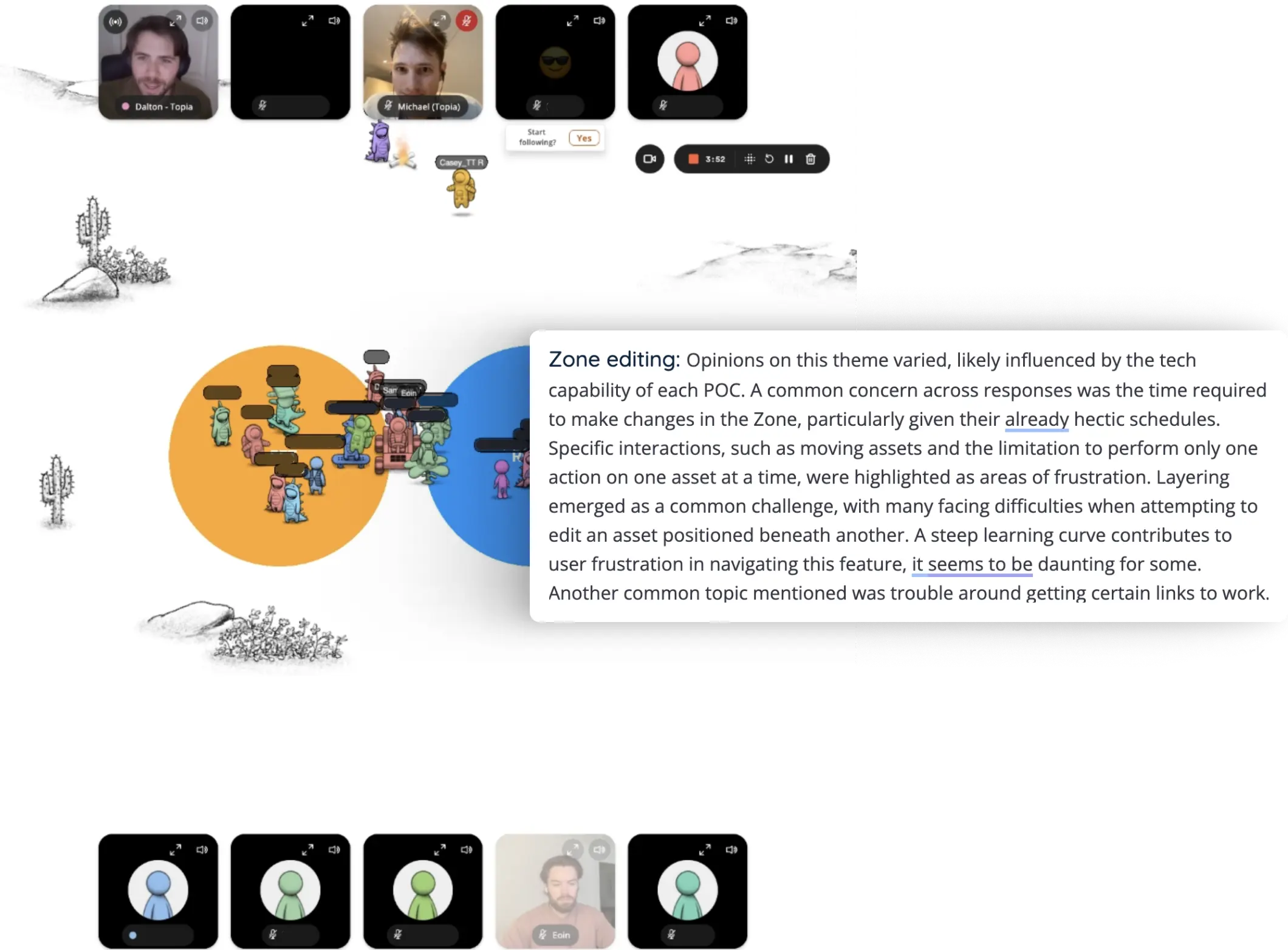
Focus groups
Our product team holds monthly focus groups. We dedicated this month's session to discussing the current tool, providing a platform for open, honest feedback, and gaining a deep understanding of user needs and frustrations.
03
definition
Theme 01
The current process of editing and building a world is time-consuming and challenging to navigate.
Theme 02
Many users find the layering feature difficult to understand.
Theme 03
Internal inspection and user reports indicate that there is insufficient help content for this feature.
Plan
Given the scope of these challenges, the target completion date, and the available resources, it became clear that addressing all the issues to a high standard in this effort was unrealistic. Therefore, I decided to prioritize and tackle Theme 01 and Theme 03 first.
Theme 01 was chosen because it will significantly improve the world-building process and have the greatest impact. Addressing the layering issues at a later date will further enhance the user experience.
Theme 03 was selected as it offers a high-value opportunity to develop a process for improving help content and overall support for all feature releases and updates without requiring engineering resources.
Next steps
After defining the project's scope, I analyzed the insights gathered on world-building to pinpoint the areas that needed improvement. I listed each problem area and summarized the key issues within each, creating a comprehensive list of requirements to guide the design decisions in the solution phase.
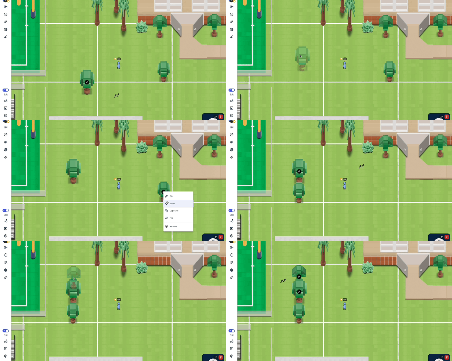
Problem 1: Single-Asset Editing
Editing is limited to one asset at a time, which makes bulk edits tedious and time-consuming. For instance, moving multiple assets requires moving each one individually. This process becomes particularly frustrating and inefficient when dealing with hundreds of assets.
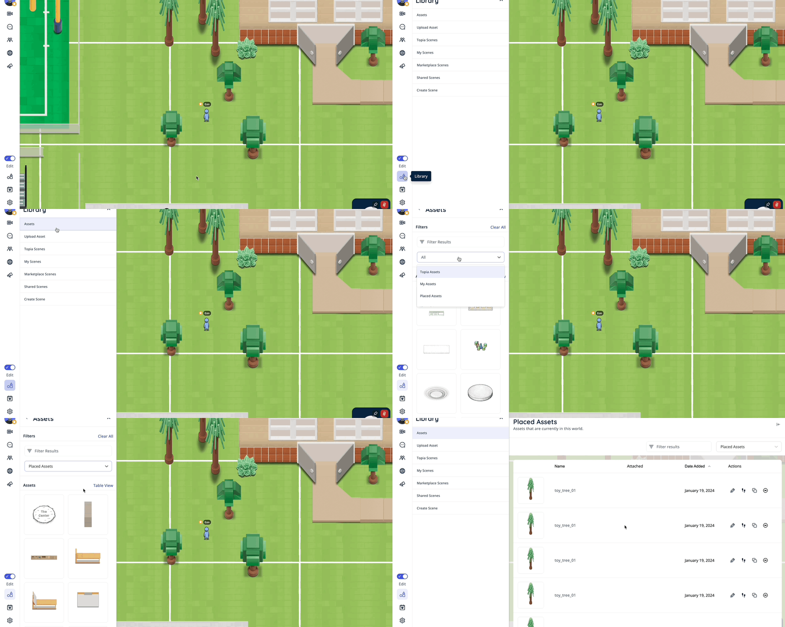
Problem 2: Hidden Functionality
Many frequently used actions and pages, such as the placed assets list, are hidden behind multiple clicks. Users find this cumbersome and would greatly appreciate quicker access to these essential features, which would streamline their workflow and improve efficiency.

Problem 3: Screen Obstruction
Many actions related to editing an asset obscure the main screen, making it difficult to see edits in real-time. Users are forced to repeatedly close and reopen the screen to check updates, which is frustrating and hampers the efficiency of making precise edits.
Problem 4: Lack of Common Industry Standard Tools
The lack of industry-standard tools typically found in editing software and apps poses challenges in creating visually appealing worlds. This limitation reduces usability and efficiency, constraining users' ability to achieve desired outcomes and detracting from the overall editing experience.
Problem 5: Editing Interruptions
Upon selecting an asset, the page closes to facilitate placement of the asset. However, if the user wishes to continue browsing assets, the table does not retain the user's last position leading to a repetitive experience.
Problem 6: Insufficient Help Content
Users find world-building challenging due to a lack of adequate training and help content. Many feel they have not received enough guidance and struggle to learn independently, highlighting a need for more comprehensive support and resources.
04
solution
Builder Mode Initiated
Initial Problems
In the past, Topia lacked a specific mode for world building, leading to limited actions and no dedicated space for editing. Initial design attempts faced challenges due to the screen space occupied by video frames, especially considering that many of our users utilize Chromebooks.
After some back-and-forth, I realized it was unwise to try to cater to every use case on Topia simultaneously. Some users want to build worlds, others want to play games, and some want to socialize. The challenge arose from attempting to make everything accessible all the time. A shift in mentality led to the concept of ‘Modes’. This approach allows us to design the best experience for each mode by prioritizing the relevant parts of the app.
For instance, when a user intentionally turns on Builder Mode, we can assume their main priority is to edit and build worlds. Therefore, we prioritize this experience, reducing the UI elements associated with socialization and freeing up space to deliver a clear and user-friendly builder experience. To retain some aspect of socialization, we decided that entering Builder Mode would automatically switch users to audio-only mode. This disables video connections but still allows audio chat, eliminating the need to render UI for video frames.
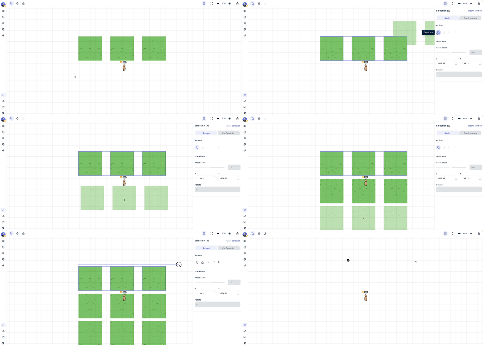
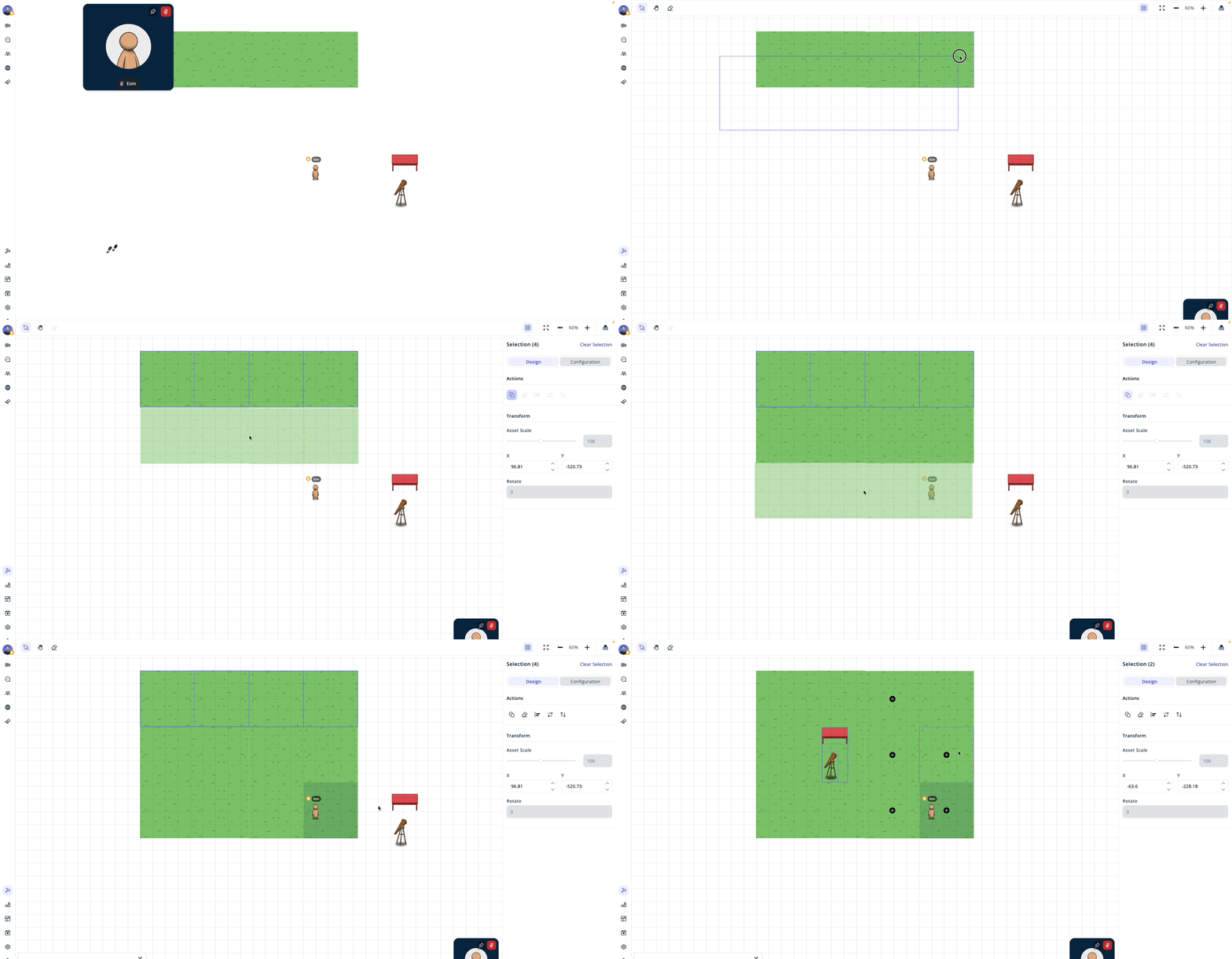
Multi-asset editing
Select and edit multiple assets simultaneously.
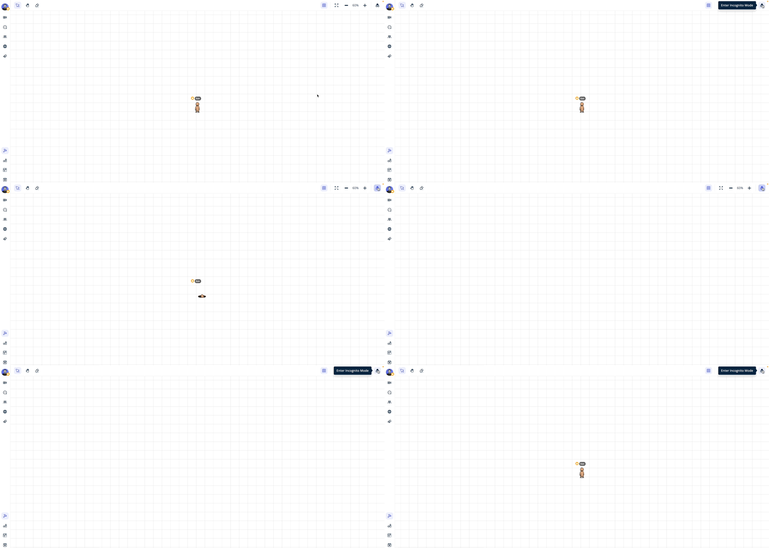
Incognito editing
Edit privately with Incognito Mode, disconnecting from other users in the world.

Easy asset selection
Directly select any asset from the list of placed assets in the drawer.
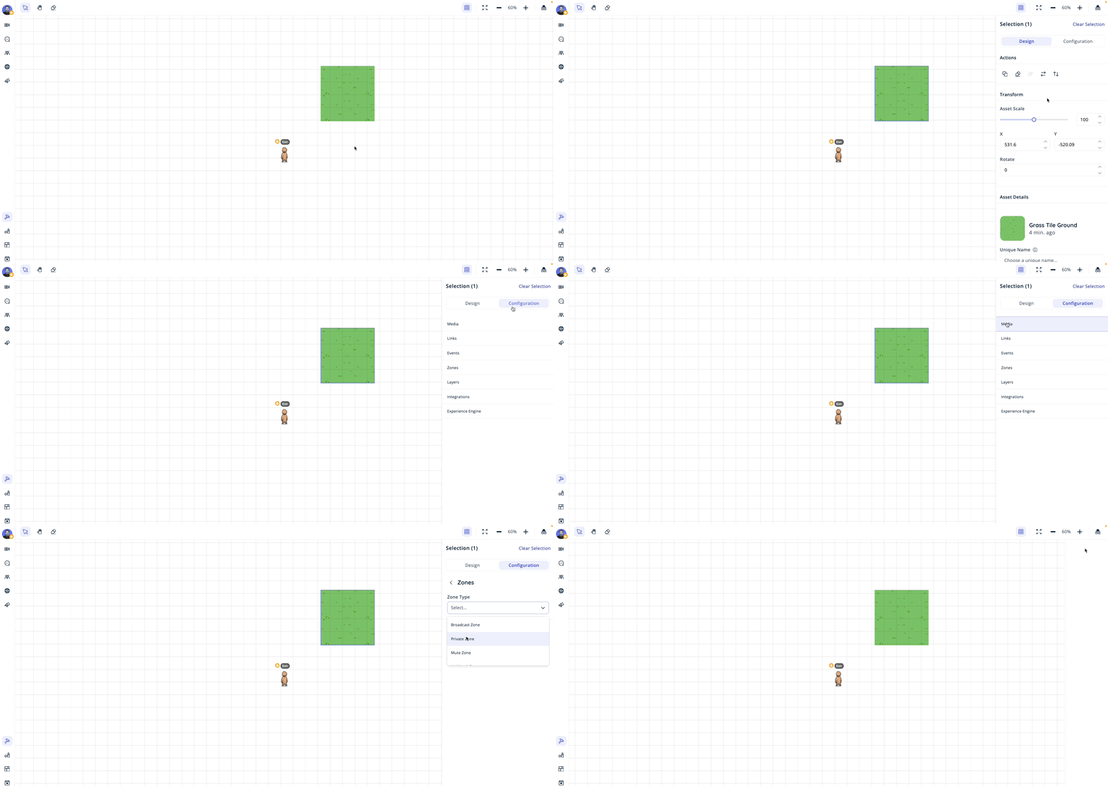
The Select Drawer
Access all actions conveniently without blocking your canvas.

Activate Builder Mode
Activate Builder Mode by clicking the builder toolbar icon.
Builder Toolbar
Access essential tools that appear when Builder Mode is enabled.
The Select Drawer
Opens when assets are selected, enabling actions on your selections.
When you have an active selection, the Select Drawer appears, giving you easy access to various actions. The select drawer utilizes a tab mechanism to give you the options you need.

Migrating the configuration settings to a drawer from a page did not require a change to any of the functionality of these settings but it did pose a challenge around redesigning components so that they would fit in a drawer. The most challenging part was that most of these pages contained tables - considering this drawer is 350px in width, tables are not very user friendly. To solve this, I designed a new type of card that would contain the information displayed in a table.


05
Launch Plan
The Launch Plan
I decided to create a ‘Launch Plan’ checklist applicable to all future feature releases and updates. While not every feature will require the full checklist, it serves as a useful guide to determine necessary launch steps during development.
QA
1. QA Plan: Develop a detailed QA plan covering all testing aspects.
2. QA Execution: Complete QA to ensure the feature is ready for release.
Documentation
1. Documentation: Update all relevant help articles and guides to include information about the new feature.
User Support
1. Hubspot Help Desk: Update all Hubspot related content.
2. Training for Support Team: Conduct training sessions for support staff on the new feature.
Marketing
1. Release Notes: Prepare detailed release notes highlighting new features, changes, and bug fixes.
2. Marketing Content: Collaborate with the art team to update marketing materials.
3. Blog Article: Write and publish a blog post detailing the new feature.
Announcements
1. Communication to Enterprise: Announce the update to all enterprise customers via via call or email.
2. Customer Knowledge Transfer: Determine if dedicated training sessions are needed or if a mass email with a walkthrough video will suffice.
Feedback and Monitoring
1. Feedback Collection: Create and distribute surveys to gather user feedback on the new feature.
06
Learnings
Prioritisation of projects
This feature update primarily affects a specific user persona who doesn't use the feature much during the summer. We strategically decided to focus on updates benefiting the more active summer users first. The key takeaway here is to be mindful of timelines and user impact, proactively recommending development schedules based on business goals and other initiatives.
Creating an epic
This project significantly improved my process for creating epics in Jira. By breaking down the work into smaller, more manageable tickets, I made the workload more accessible for our engineering team. This approach streamlined development and ensured clearer progress tracking.
Need for iteration
In hindsight, I regret some of the styling choices I made for this feature. While initially satisfied, seeing it live revealed areas for improvement. This taught me the importance of continuous iteration, even when a solution seems complete. Iterative design ensures that the final product meets high standards and user expectations.
Pick Your Battles
Due to resource and time constraints, it was crucial to identify essential elements for the developed feature. Making strategic trade-offs ensured successful collaboration, balancing the delivery of a high-quality feature while maintaining the tech team's morale throughout the process.
Launch plan
Developing the launch plan for this feature underscored the importance of best practices for feature launches. This experience highlighted the need for a detailed and organized plan before release, considering user perspectives like: "As a user, I don't know how to do x with this feature - where can I find out how to do it?" This user-centric approach is crucial for a successful launch.
Communication Early and Often
While I generally uphold strong communication practices, large projects reveal the critical need for regular and early check-ins between product and tech teams. This ensures we are all aligned, using our time wisely, and avoiding any sprint planning surprises.
